close
x
lines
logo plus
logo

MOBILE APP "CARE OF BEAUTY"

"Care of Beauty" is a mobile marketplace app that allows beauty professionals to find suppliers and professional cosmetics for their jobs. The app simplifies the search and ordering process, providing an opportunity for suppliers to display their products to industry experts. As the UX/UI designer for this project, I developed an MVP (Minimum Viable Product) concept for a beauty store marketplace to evaluate its viability

TIMELINE:
1 month
TYPE:
Mobile app
ROLE:
UX/UI Designer
TEAM:
2 UX/UI designers
1 Project manager
2 Developers
(Care of beauty)
photo phone

/BUSINESS GOALS

  • Increase Number of Downloads: Aim to reach 1,500 downloads by the end of the next quarter following the launch.
  • Boost Active Users: Achieve steady increases in daily and monthly active users among beauty professionals and suppliers.
  • Expand User Base: Target a wider range of beauty professionals and suppliers.
  • Brand Establishment: Establish brand recognition and trust within the beauty community, positioning the app as reliable and innovative.
  • User-Friendly App: Develop an app that is user-friendly, catering specifically to the needs of both target audiences: beauty specialists and suppliers.
  • Project Viability: Assess the project's viability and potential for success within the beauty market.
(Posters for articles)
close
x
s

(1)RESEARCH

To gain knowledge about the market, competitors, and target audience, I conducted three types of user research, starting with competitive analysis, then moving on to user interviews and card sorting.

COMPETITIVE ANALYSIS:

The analysis revealed no direct competitors, highlighting a clear market opportunity. However, two indirect competitors were identified:

  • Large-scale marketplaces with a broad product range, including beauty materials, such as AliExpress, Wildberries, Ozon, and Avito.
  • Local markets where beauty specialists traditionally purchase their materials offline.
USER INTERVIEWS:

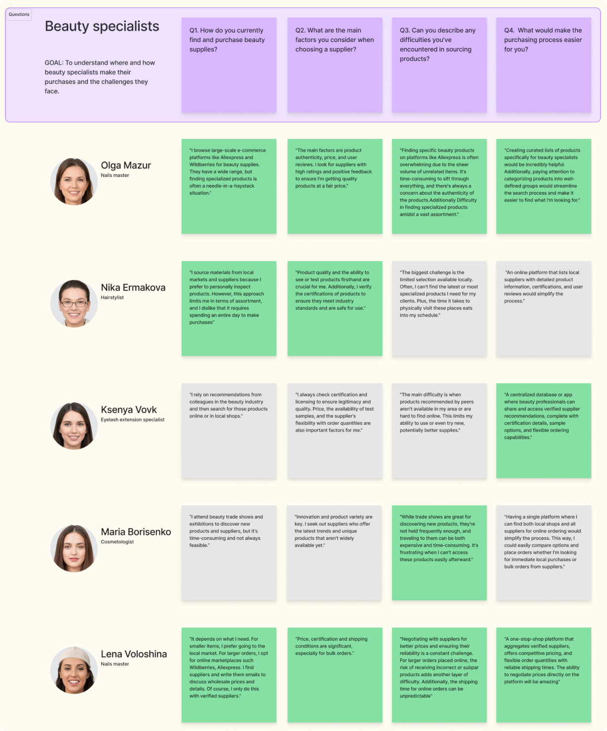
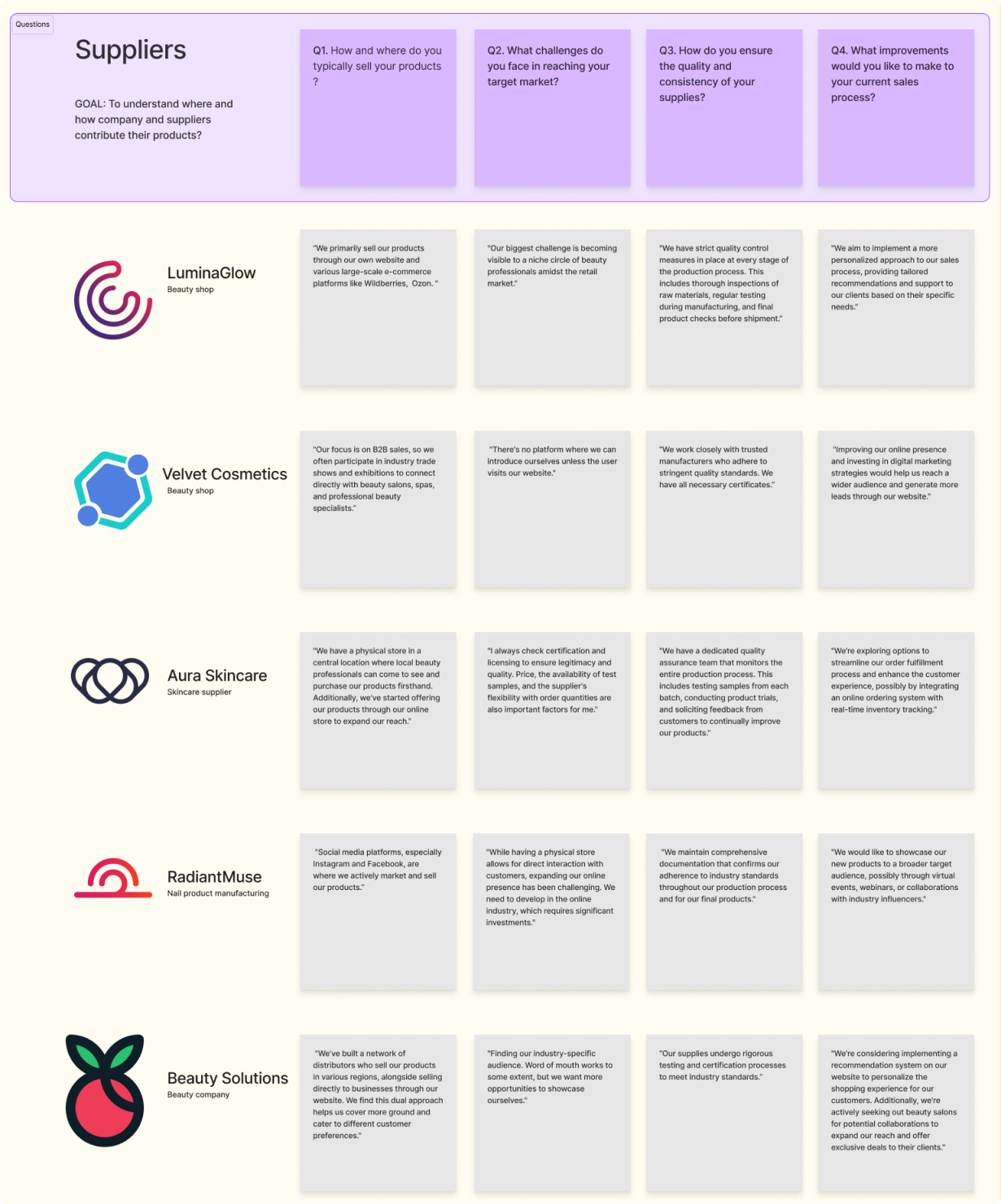
We organized brief interviews with 5 beauty specialists and 5 local suppliers. This aimed to understand where and how beauty specialists make their purchases and the challenges suppliers face in the supply process.

KEY FINDINGS FROM USER INTERVIEWS:

Beauty Specialists:

  • Trust & Quality: High importance on supplier reliability and product certifications.
  • Direct Communication: A strong preference for direct communication with suppliers for negotiations or order details.
  • Reviews: Dependence on reviews from other users to make informed product choices.
  • Support for Local Brands: A tendency to support local companies for potentially faster shipping.
  • Search Functionality: Need better categorization and search for products.

Suppliers:

  • Sales Channels: Primarily use their own websites or e-commerce platforms.
  • Market Visibility: One of the biggest challenges faced is increasing visibility in an online market.
(User interviews)
close
x
o o

/CARD SORTING

Our research included two card sorting sessions with beauty industry professionals using Optimal Workshop. The first, a hybrid sort, investigated user navigation and search behaviors in a catalog. The second, a closed sort, showed the key elements needed on product cards and product pages for decision-making.

sq
KEY FINDINGS:
  • Body Part Grouping Preference: Strong preference for organizing products by body part for targeted searches.
  • Importance of Sub-Categories: Preference for sub-categorizing products (e.g., Moisturizers, Cleansers, Masks under "Face").
  • Body vs. Spa Products: Despite confusion, 70% favored separating "Body" and "Spa" products into distinct categories.
  • Essential Product Card Details: Agreement on essential details: name, brand, country, reviews, and images.
  • Crucial Product Page Elements: Agreement on crucial elements similar to cards, plus quantity, "Send a message", "Order" button, and application instructions.
  • Preference for Local Brands: Interviews showed a preference for local brands, but 80% in card sorting saw local sourcing as a nice-to-have.
(Card Sorting for Catalog, Product Сard)
close
x

(2)IDEATION

Based on the insights gathered from interviews and card sorting, our brainstorming session generated several ideas, including:
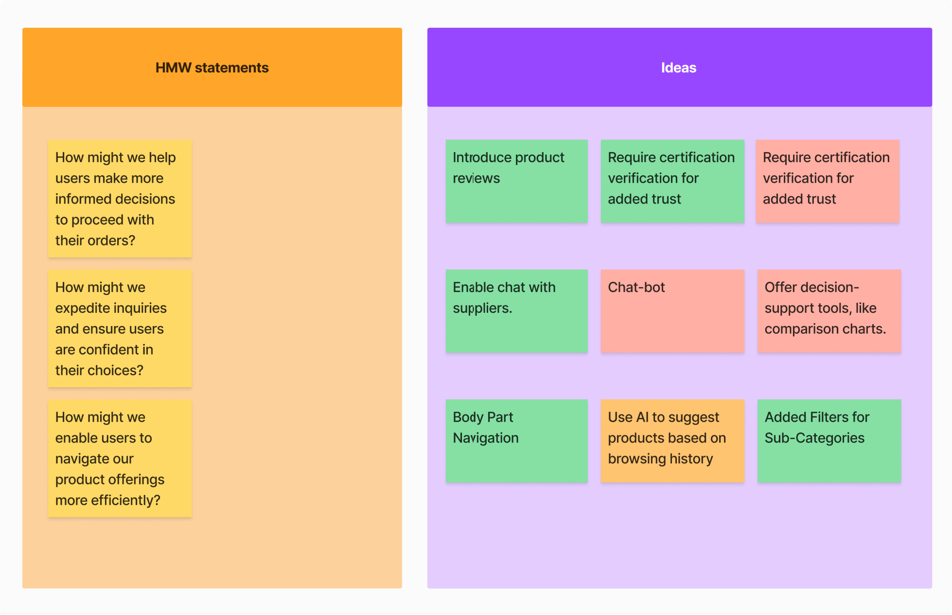
  • Product Reviews: The planned addition of a review feature in future iterations will enable users to make informed decisions.
  • Direct Messaging: Introduced a direct communication feature with suppliers for easier inquiries and negotiations.
  • Body Part Navigation: Users have a clear preference for searching and selecting products categorized by body part.
  • Filter by Sub-Categories: Added filters for more precise searches within main categories.
  • Certifications for Trust: Required beauty specialists and suppliers to provide professional and product certifications at registration to enhance trust and credibility.
(Ideation session)
close
x
o

/USER FLOW

sq
BEAUTY INDUSTRY SPECIALISTS

The beauty specialists' user flow facilitates fast search and purchase. Post-registration, specialists have three search options:

  • Search Bar: Ideal for users who know exactly what they're looking for, offering instant results.
  • All Products Tab: Displays a comprehensive list of products relevant to their industry, as specified during registration.
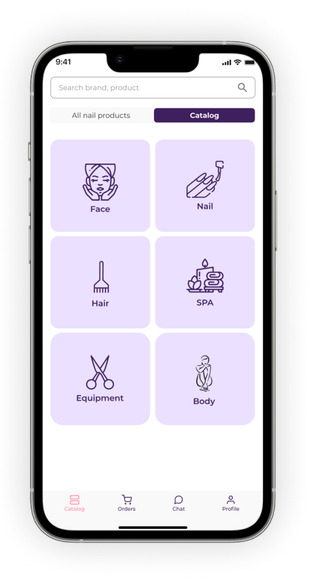
  • Catalog: Methodically organized by body parts and further divided into detailed sub-categories for a more targeted browsing experience.
sq
SUPPLIER

The supplier user flow is crafted to simplify product management. Suppliers can:
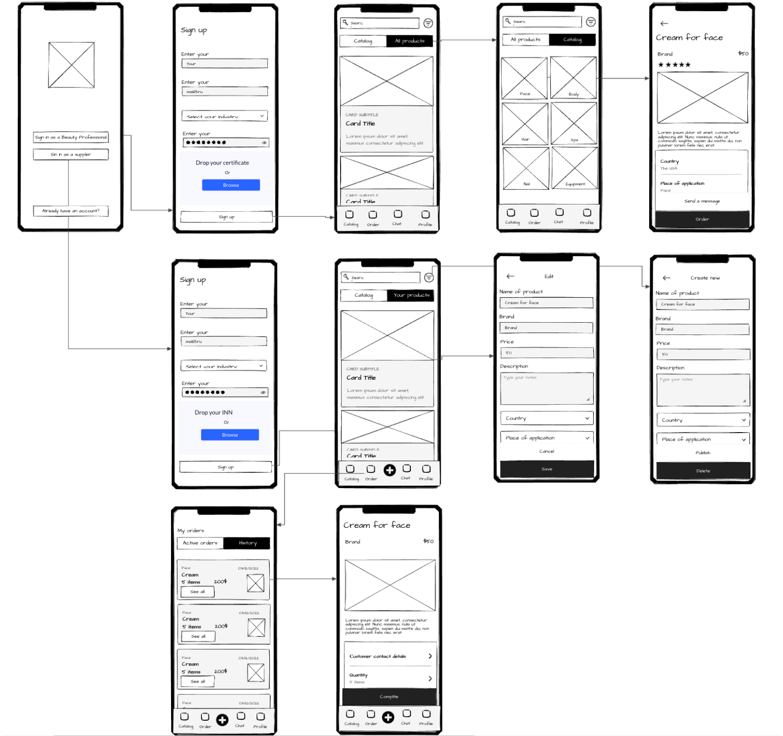
  • Create and Edit Product Cards: Effortlessly add and update their products on the platform.
  • Order Oversight: View and manage all incoming orders in one place, streamlining the process from sale to fulfillment.
(User Flow for Searching and Managing Items)
close
x

(3)PROTOTYPE

I created clickable prototypes based on main flows for Beauty Industry Specialists and Suppliers to test our design assumptions:

  • Beauty Specialists: Aimed to test user navigation and the ordering process, focusing on how easily users can find and purchase products.
  • Suppliers: Focused on assessing the ease of adding products and managing orders, ensuring a smooth operation for suppliers on the platform.
(Prototype for Specialists and Suppliers)
close
x

(4)TESTING

Limited by time and resources, we tested with 5 nail industry specialists and 4 hair product suppliers, asking every one of them to complete 2 tasks to evaluate our concepts and gather insights.
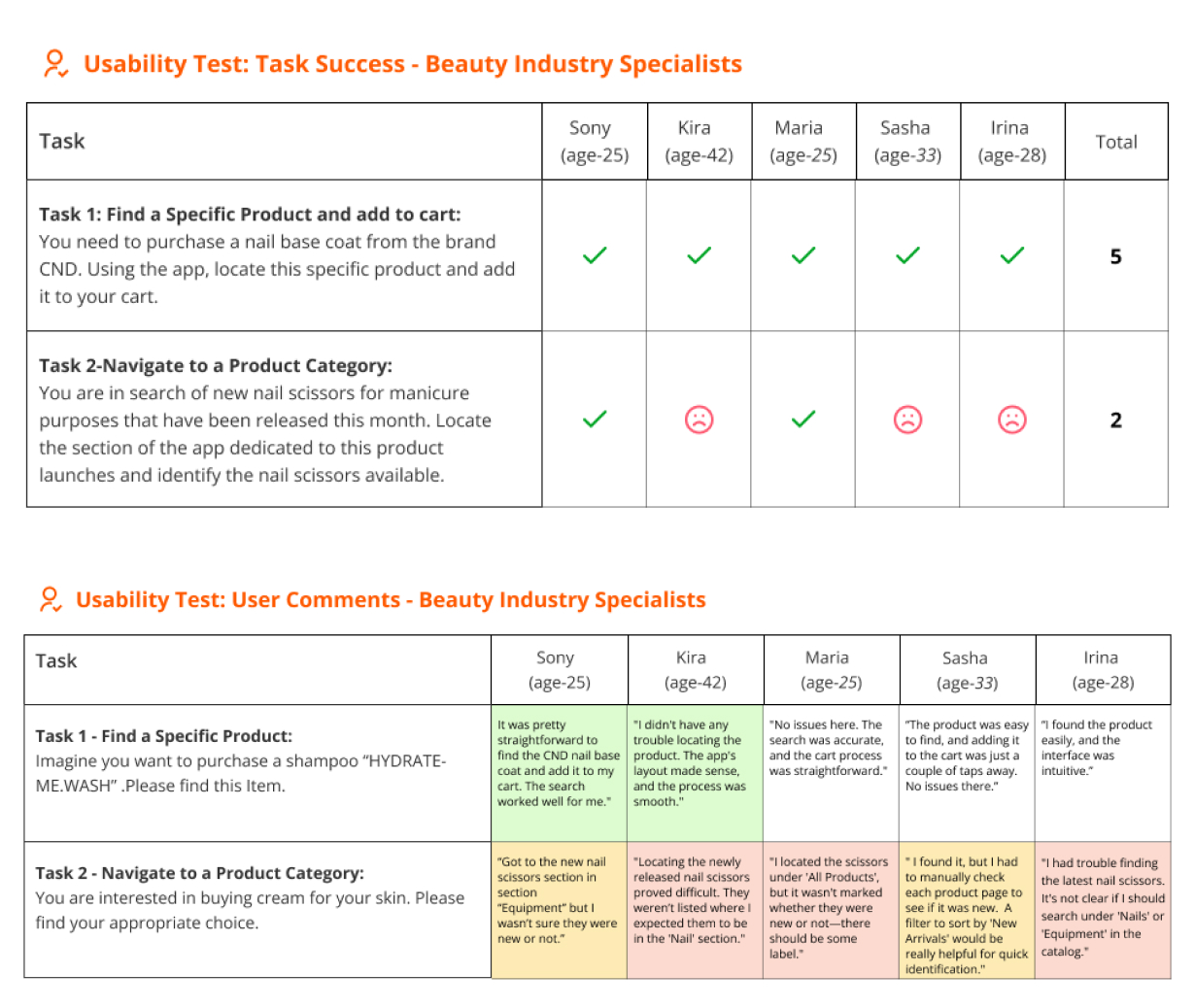
FINDINGS FROM BEAUTY INDUSTRY SPECIALISTS:
  • Product Search Bar Efficiency: The search bar proved efficient for users who knew exactly what they were looking for.
  • New Arrivals Visibility: Users faced difficulty finding new arrival items, indicating the need for a clearer "new arrivals" filter.
  • Confusion with Multipurpose Items: There was confusion regarding items like scissors that serve multiple purposes, suggesting a need to place them in all relevant categories to aid discovery.
  • Need for Saving Products: Users expressed a need to save items, pointing out an opportunity to improve the user experience by adding this feature.
FINDINGS FROM SUPPLIERS:
  • Product Creation Process: Suppliers appreciated the intuitive process for creating products but desired greater customization options.
  • Platform Preference for Operations: Suppliers emphasized a preference for using laptops and desktops for creating and managing orders, with mobile platforms used for monitoring. This reveals an opportunity to improve by creating a more comprehensive dashboard in future developments.
  • Automation of Management Processes: Suppliers expressed a desire for future features like automated shipping number integration, highlighting another area for improvement and development.
(Usability Testing)
close
x

(5)DESIGN

DESIGN WORKFLOW BREAKDOWN:
  • Industry Analysis: Conducted research to gain a comprehensive understanding of visual identity.
  • Mood Board Creation: Developed a mood board to guide visual identity direction.
  • Design Presentation: Showcased our design concept to clients for feedback.
  • UI Kit Assembly: Developed a UI kit to ensure design consistency and efficiency.
  • Design: Created all necessary frames for the app.
DESIGN CONCEPT PILLARS:
  • Design Philosophy: Adopted a minimalist approach for straightforward, functional design
  • User-Friendly Aesthetics: Crafted a clean interface with vibrant buttons and intuitive icons.
  • Color Selection: Chose pink and purple color to align with the beauty industry identity.
(Mood board and UI-KIT)
close
x

(6)OUTCOMES

  • Strong Market Entry: Successfully achieved our target with 1,649 downloads by the end of the next quarter post-launch, demonstrating strong market potential and interest in the app.
  • Solid Retention Rate: Achieved a 30% retention rate within the first 30 days, indicating value perceived by users and potential for sustained growth.
  • User-Friendly Experience: Developed an intuitive app that effectively serves our two target audiences, as reflected in positive usability feedback.

All set business goals were successfully met following the MVP launch, during which we also identified key areas for improvement:
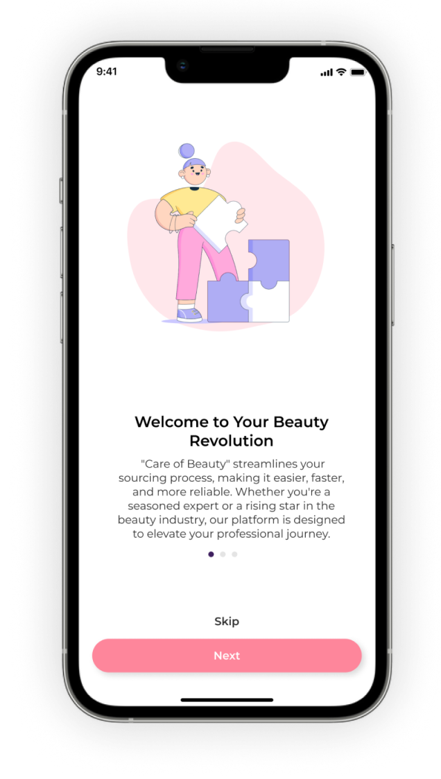
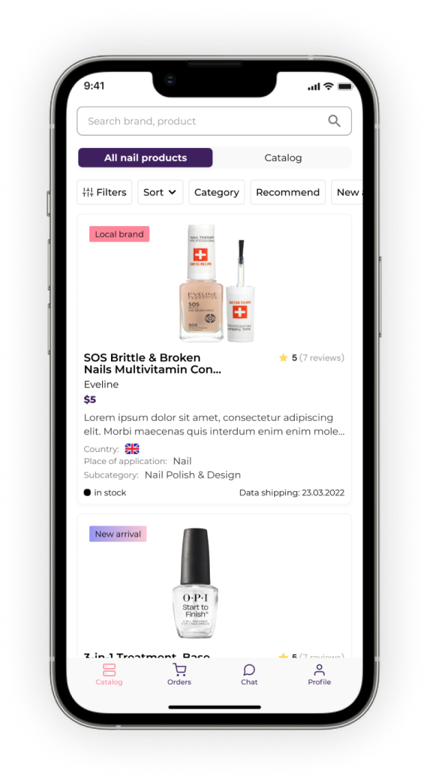
  • Enhance supplier functionality with a desktop-optimized dashboard to simplify order management, allow for customization of industry-specific products, and enable automatic updates.
  • Introduce features such as product reviews and shipping number management for specialists to streamline transactions and improve overall user experience.
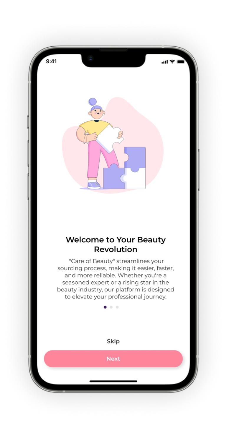
(Onboarding and Catalog Screens)
close
x
pn pn pn

(7)KEY LEARNINGS

Reflecting on the project, one of our key learnings was the importance of pre-testing.

PRE-TESTING:

During a testing session, I identified several overlooked issues in our prepared user scenarios and tasks. Key features were missing, such as the ability to save products and a filter for searching new categories, which were supposed to be included in the tasks. These issues made task completion difficult for users and caused confusion.

After the initial user interview and recognizing these issues, I decided to refine our scenarios and tasks. To ensure no further problems would disrupt our testing process or compromise data accuracy, I conducted a pre-test with colleagues.

It helped us to refine our testing process, ensuring more thorough preparation and smoother execution with our target audience. This experience emphasized the importance of pre-testing with the team, and now, I always conduct selective testing with team members before sessions with users.
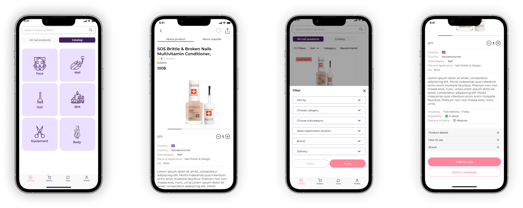
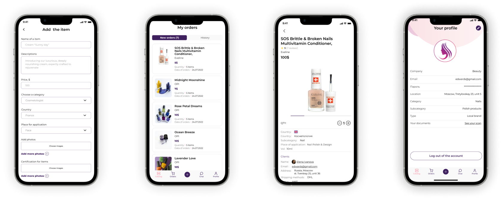
(Other Screens)
close
x
next
Any questions?
BEHANCE LINKEDIN EMAIL
plus
NEXT PROJECT
(CORPORATE WEBSITE)