lines
logo plus
logo
close
x

BEAUTY STORE "ECOL"

Ecol Store is an online beauty retailer specializing in organic products and professional solutions designed exclusively to enhance women's beauty and preserve youth. Offering high-quality products for skincare, hair, and body care, the store provides a diverse selection that meets the beauty needs of the entire family, including men and children.

TIMELINE:
2 month
TYPE:
E-commerce
ROLE:
UX/UI Designer
TEAM:
Art Director
Developer
Project manager
(Ecol)
photo phone

/PROBLEMS

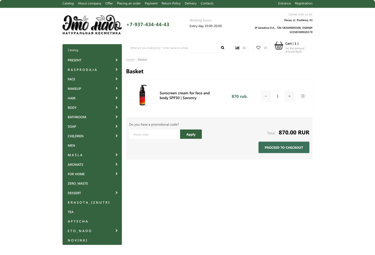
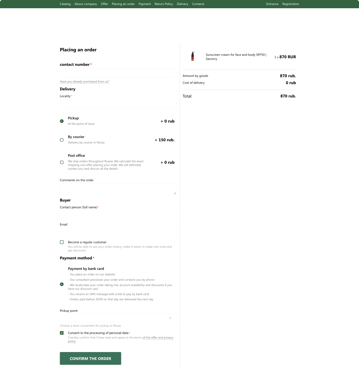
  • Low Conversion Rate: Google Analytics data shows a 3% conversion rate. This meant that shoppers weren't completing their purchases as business had hoped.
  • Cart Abandonment Issues: A 70% cart abandonment rate indicates crucial problems in the purchasing process that prevent users from completing their transactions.
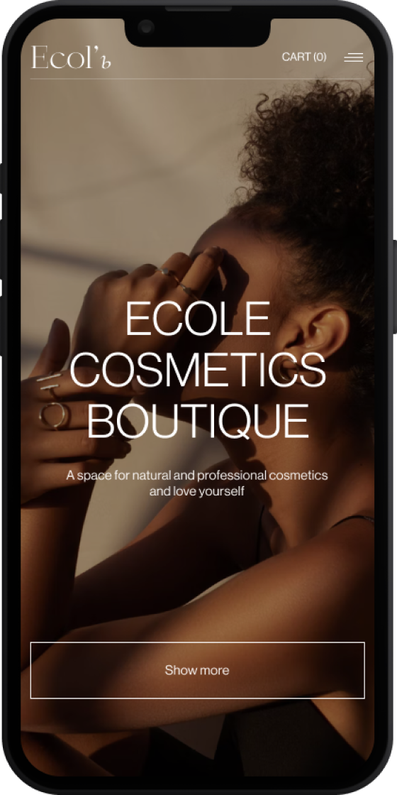
  • Outdated Design: The old website looked outdated, which made users less likely to trust and enjoy using it.
(Before Redesign: Main and Product Page)
close
x
bef bef

/BUSINESS GOALS

  • Boost conversion rates by 1.5-2 times: to make it more likely for visitors to make a purchase.
  • Increase the average value: of each customer transaction.
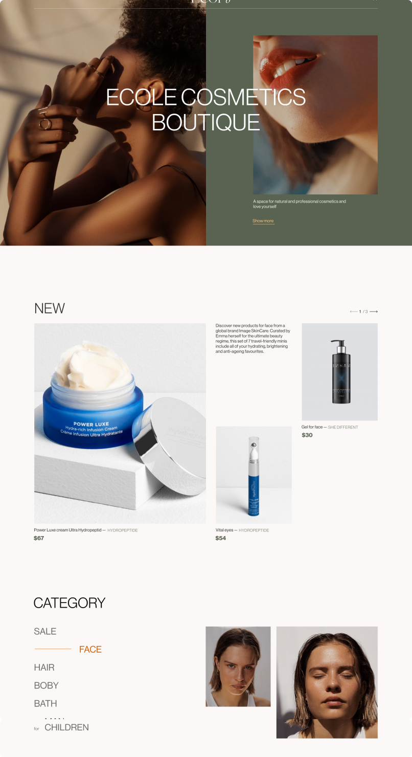
  • Redesign the website to be both modern and luxurious: ensuring it aligns with current trends.
  • Stand Out from Competitors: by introducing unique design elements, features, and content to distinguish the website in the beauty and skincare market.
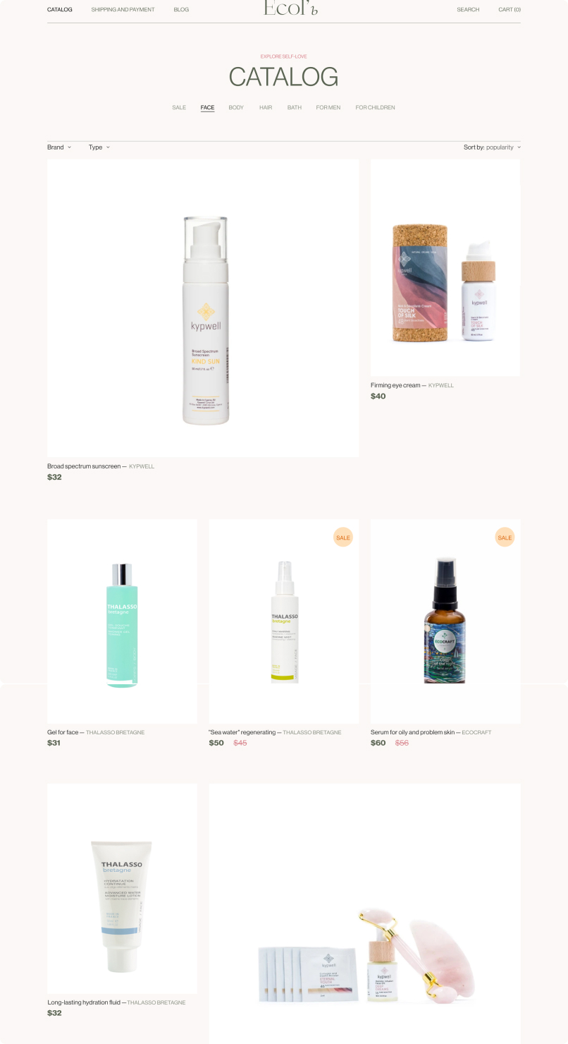
(After Redesign: Main,Product and Catalog Page)
close
x
bef bef bef

(1)PROJECT BRIEF

In our design process, I used the Design Thinking framework, customizing it for our project. We went through stages such as conducting research, organizing information architecture, wireframing, testing, and designing. It allowed us to go step by step, breaking down ambitious goals into small tasks.

In the initial phase, I met with stakeholders to understand the project goals, challenges, the client's preferences and target audience. The project's target audience comprises women aged 30-55 with medium to high income, who place a strong emphasis on their personal appearance.

(Briefing)
close
x
bef bef bef

(2)RESEARCH

Two primary research methods were employed during this project: competitive analysis and usability testing.

triangle
COMPETITIVE ANALYSIS

I analyzed 4 major beauty and skincare industry players, examining market position, user experience and design.

triangle
COMPETITOR HIGHLIGHTS
  • Navigation & Clarity: Sites are cluttered and lack intuitive categorization and navigation;
  • Content Balance: Pages contain excessive information, highlighting the need for a minimalist design;
  • Quick Facts: Competitors' pages miss a 'Quick Facts' section for product highlights;
  • Detailed Product Information: Sites offer comprehensive product details aiding decision-making;
  • Recommendations: Existing recommendations engage users and boost sales;
  • Product Display: Listings typically show the product name, price, photo, and brand clearly;
  • Customer Reviews: Luxury brands often exclude customer reviews;
  • Color & Design: The prevalent use of traditionally feminine colors suggests an opportunity to either continue this trend or differentiate with a more natural palette;
(Competitive analysis)
close
x
img
frown
1.LACK OF CATEGORIZATION

Product pages are cluttered with details and lack organization.

2.NO QUICK FACTS SECTION

No quick summary for hurried users to grasp product highlights.

smile
1.PROMOTIONS AND RECOMMENDATIONS

Competitors' efficient promotion and recommendation display could enhance user engagement and sales.

2.DETAILED PRODUCT INFORMATION

The page provides in-depth details about the product, including main active ingredients and their benefits.

frown
1.LACK OF INTUITIVE NAVIGATION

The site have a complex navigation structure that could be confusing.

2.INFORMATION OVERLOAD

The page is crowded with various elements, which can be overwhelming.

smile
1.HIGHLIGHTED PROMOTIONS

Prominent 'New items' and 'Promotions' sections likely attract deal-seeking customers.

img
triangle
USABILITY TESTING

To gain deeper insights into the challenges and pain points that users face with our old website, we opted for a focused usability test. We recruited 5 female participants aged 30+ to represent our primary user demographic.

triangle
USABILITY TESTING
  • No Search Function: Users had trouble finding products without a search bar when they know what they are looking for.
  • Difficult Navigation: The catalog layout led to confusion and difficulty in product discovery.
  • Limited Product Details: Only name and cost were provided, not enough for purchase decisions.
  • Forced Sign-In: Mandatory sign-in at checkout was a major user deterrent.
  • No Apple Pay Option: The lack of Apple Pay as a payment method was also noted as a limitation for users.
(Usability Test)
close
x
wrap wrap

(3)IDEATION

To stand out from competitors and assist customers in making informed choices, I implemented two strategic solutions:

  • WhatsApp Support Chat: Provides personalized skincare consultations with a cosmetologist, catering especially to women who often struggle to find products that suit their skin type and needs. If successful, plans are in place to expand this with automated tools and services.
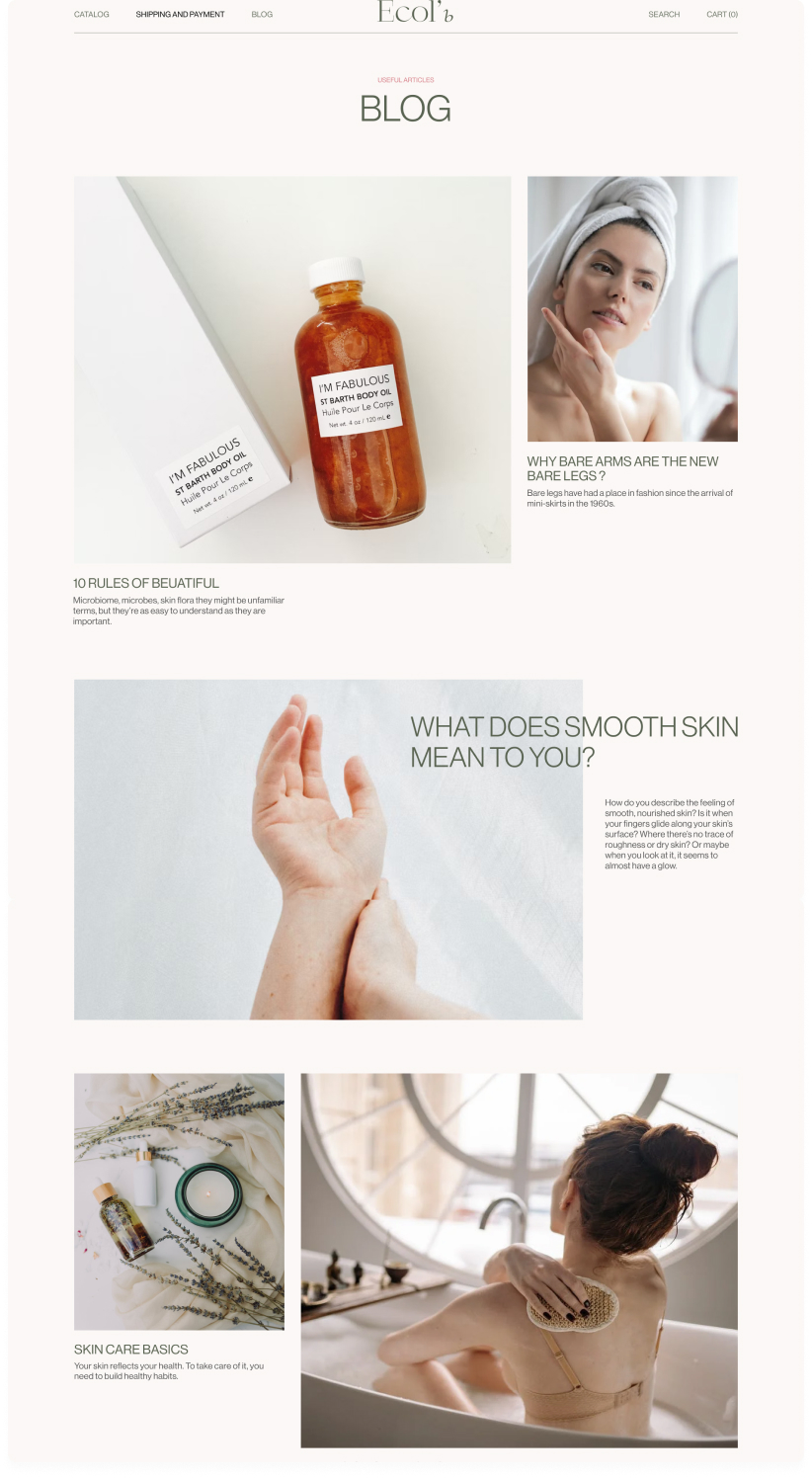
  • Educational Blog: Managed by expert cosmetologists, this blog offers guidance on skincare, enhancing the customer's product selection experience.
(Support and Blog)
close
x
photo photo photo photo text

/INFORMATION ARCHITECTURE

We have identified two primary components within our information architecture that are crucial for decision-making: product cards and product pages.

triangle
PRODUCT CARDS:
  • Adopt elements similar to competitors, featuring the product name, brand, price, and photo.
  • Omit customer reviews to enhance the perception of our brand as a luxury option.
triangle
PRODUCT PAGES
  • Provide detailed product information, including descriptions, volume, specifications, application methods, and ingredients.
  • Include a recommendation system for complementary items to increase the average order value.
(Information Architecture)
close
x
photo phone

(4)WIREFRAME

I developed wireframes to define the website's structure, focusing on three main areas:

  • The Catalog: This section organizes the range of products.
  • The Product Page: It provides detailed information about each item.
  • The Checkout Process: This path streamlines the purchase procedure.

These wireframes help me validate my assumptions with the real target audience, enhancing the user experience.

(Low-fi, Hi-fi)
close
x
lo
lo lo
lo

(5)TESTING

We conducted user testing with 5 participants, asking them to complete the same 4 tasks that were included in our usability tests to evaluate our improvements. Low-fidelity prototype testing has revealed:

triangle
POSITIVE INSIGHTS:
  • The new Product Search bar was well-received by users, facilitating searches for specific items.
  • Improvements in categorization based on body types and the addition of sorting and filtering options were appreciated by customers.
  • The Checkout Process was streamlined by eliminating the requirement to sign in or sign up before making a purchase, and by adding mobile payment options. All users found the tasks easier to complete and appreciated the new changes.
triangle
AREAS FOR IMPROVEMENT:
  • Implement a "Type of Skin" filter to refine the system, meeting user needs.
(Usability Testing)
close
x
us us

(6)DESIGN

  • Color Palette: To stand out from competitors and emphasize the organic concept of our brand, I chose natural colors such as dust green and orange. These colors are associated with nature and health.
  • Fonts: I selected Neue Haas Grotesk for its modern, clean aesthetic, which enhances readability and adds a touch of sophistication.
  • Style: I adopted a minimalist style featuring ample white space and neutral tones, highlighting the luxury and quality of our offerings.
(Moodboard)
close
x
mood mood
mood mood

(7)OUTCOMES

In our efforts to balance user needs with business objectives, we successfully achieved milestones in both areas:

triangle
BUSINESS GOALS:
  • Conversion Rates: Increased from 3% to 5.6%, indicating a higher rate of purchase completions.
  • Value: Recommendations on product pages raised the average transaction value.
  • Website Updates: Adjustments were made to align with current trends, enhancing user appeal.
triangle
USER NEEDS:
  • Search Bar Addition: Implemented to allow users to quickly find specific products.
  • Catalog Enhancement: Categories were refined and filters added, enabling intuitive navigation and optimal searching.
  • Product Page Optimization: Streamlined to include only essential information, reducing user overwhelm.
  • Guest Checkout: Removed the requirement for sign-up, simplifying the purchasing process
  • Mobile Payment Methods: Added mobile payment options to accommodate a wider range of user preferences and enhance transaction ease.
(Key pages: Product , Checkout and Catalog Page)
close
x
img
1. SEARCH BAR ADDED ON ALL PAGES

Ensuring easy product access with a header search bar on each page.

2. INFORMATION PAGE OPTIMIZED:

Streamlined for cleaner, more efficient user access to information.

3. PRODUCT RECOMMENDATIONS:

Implemented to boost customer spending by suggesting similar items

1. SIMPLIFIED CHECKOUT:

Reduced to two steps and removed non-essential fields.

2. NO MANDATORY REGISTRATION:

Eliminated to reduce cart abandonment.

3. EXPANDED PAYMENT METHODS

Added Apple Pay alongside traditional options

img
img
1. REFINED CATALOG CATEGORIZATION:

Products organized into clear groups.

2. NO MANDATORY REGISTRATION

Eliminated to reduce cart abandonment.

1. ADVANCED FILTERING

New filters for brand, type of products, type of skin.

(8)KEY LEARNINGS

Reflecting on this project, I gained several specific and impactful lessons, particularly regarding assumptions, user testing, and communication:

triangle
EARLY COLLABORATION WITH DEVELOPERS:

Involving developers early in the design process is crucial. We learned this after needing to adjust our high-fidelity prototypes' grid due to not consulting with developers about technical constraints initially.

triangle
EARLY USER TESTING:

User Testing: Initially, we hesitated to conduct early testing and considered testing only after final design. However, we later decided to validate key actions and improvement hypotheses early. This allowed us to spot and address filtering system flaws in the initial stages, saving costs in subsequent sprints.

(Product page)
close
x
mood mood mood
next
Any questions?
BEHANCE LINKEDIN EMAIL
plus
NEXT PROJECT
(PORTFOLIO)